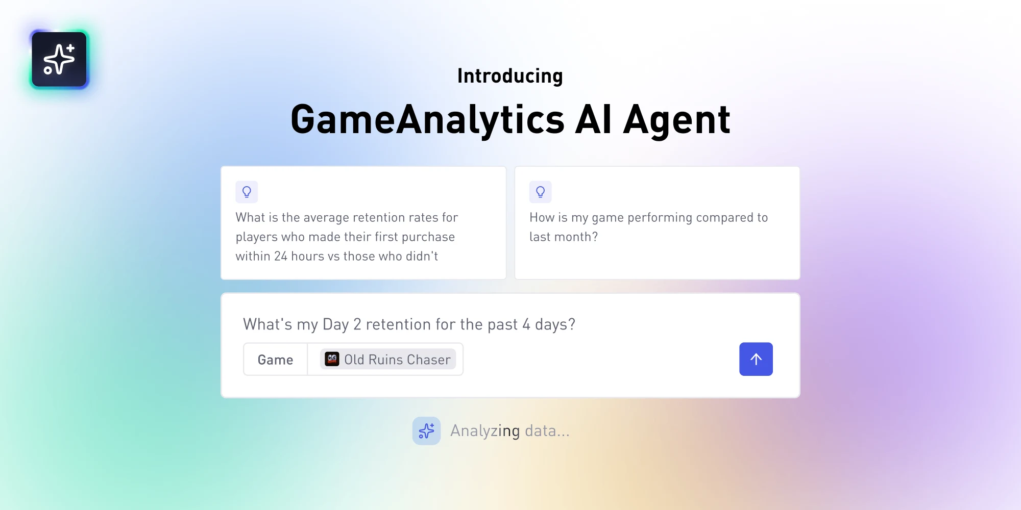
· 12 min read

How To Make Your Game UI Shine & Increase Conversions

Great UI does more than enable your player to play the game: it can make or break your revenue. Follow these tips to increase sales with persuasive UI.

Why game UI matters

Maybe you want to help the players find their way through the menus. You may also want to increase your sales. Regardless of your goal, you can achieve it all by using the principles of design the right way and measuring the impact of your changes.

We want people to find their way around the game, to even focus on the game. To make this a reality, we should remove friction in the interface. We don’t want the player to waste time in the menus. We want them to get the information they need through the interface. No more, no less. Unlike the gameplay, you pretty much always want to simplify navigation as much as you can. This has nothing to do with the game’s difficulty or “casual” gaming.

In mobile titles, the interface does not only allow the player to play the game: it can make or break your revenue. Think of the shop button. It allows the user to unlock the full game or to get virtual cash. If it’s ugly, hard to see or unclear, the user is less likely to notice and to press it. Web designers know that well and use a combination of graphic design and analytics to make the most of every major element on the applications they build: forms, menus, buttons.

Cut the Rope Time travel main menu screen
There are plenty of great references to draw inspiration from on Pinterest

You will quickly see that this article puts these principles of UX design for games into practice. Without further ado, here are my key tips to improve your game’s UI.

Embrace consistency

Consistency is one of the biggest keys to success when we’re talking about design. You want to apply the same set of rules to your entire interface. At least whenever possible. If you break them, only do so in special circumstances, when you don’t have a choice. For example, if you add a notification system to your free to play game, sure, you won’t style and animate it the same way as the rest of your buttons. However, you’ll still want to reuse design elements like rounded corners, your color palette, and bevels or dropped shadow effects.

Defining a precise style guide

There are 2 reasons why you want to define and follow a precise style guide:

  1. If everything looks and works in a similar manner your UI will feel more intuitive to the player.
  2. This will allow you to make your assets modular, to reuse elements, thus save you a lot of time.

From the first UI assets you create, try to think about the characteristics that everything will share. This can boil down to the shine that you add on top of a sprite to make it pop. Or this could be the bevel you add to edges to soften them and make them fit your vibrant game world.

To be more precise, you want to be consistent with every visual or audio cue your UI gives to the player. This includes the position and anchoring on the screen, the layout (i.e. listing settings horizontally or vertically), the types of easings you use for tweening, the styles you apply to your layers in Photoshop, your color palette, etc. The principles you choose to apply go beyond the look of a single button in isolation.

And feel free to plot your style guide in a visual way. I like to work with a single Photoshop document with base UI component with layer groups ready to copy and paste. Then, every time you create a new menu for the player to explore, you just open that document, and drag and drop layers to the new one or build the UI in place. This just makes your interface modular. You can take advantage of layer styles and color palettes to save all this precious work for later, and even reuse and refine them from project to project!

Working with visual style guides is common in the world of web design, and when building applications of all sorts. There are plenty for you to get inspiration from online, but I invite you to read Google’s material guidelines. The company shared the UI style guide they use for all of their products, and it is filled with valuable tips and more importantly tons of visual examples. This is a great reference to understand how to apply the fundamental principles of visual design to make your UI clear and consistent. It is still a smartly designed system, and a lot of its teachings are applicable to wildly different types of interfaces.

Create visual hierarchy

If all buttons should share similar characteristics, you still want to have some visual hierarchy. Make the more important ones prominent using size, color contrast, and more detailed animation. Having a unique sound effect is also common for the play and the buy buttons for example. And as you probably understand, the most important buttons are the ones the players will have to press most often (play, go to next level, etc.), but also the ones you want them to notice, like the in-game shop.

Cut the Rope in game shop
The costume icon sticks out of the frame and uses a bright orange background. Thanks to that, the whole block with the buy button stands out

You do want to stay true to the core design of your UI most of the time. You can’t just make a 100% unique sprite that clashes with the rest of your UI. Try to stay true to the rules that you based your assets upon. Then, you can use the following 4 tools to create visual hierarchy.

Position or layout

If multiple elements are aligned with one another, be it horizontally or vertically, and they are all the same size, they feel like they are at the same level. Of the same importance. Offset one of them, put it on its own row, and suddenly it will pop a lot more.

Game level end menu with a prominent replay button

In this example, the player did not get the best score possible. In this case, he will most likely want to play again, try to beat his last trial. That is why the shape of the replay button, its color and its position are all used to make it more prominent than anything else on the interface.

Color contrast

Use a different main color for the button you want the player to notice. Green is common on the web as we rarely use it for other elements, and as it is perceived as being positive. Avoid red tones. You should keep those for canceling operations and discarding elements from a list. As that is the color of blood, it suggests danger and emotively feels a bit more negative.

Size

The larger something is compared to everything around it, the easier it is for us to notice. To create hierarchy, you do not only want to make UI elements big: you a single element to be larger than all the others around it. You can use that to make an option seem more common or prominent, like your play and shop buttons.

Animation

An animated glow cycle or wiggles in the button will grab the player’s attention. Again, make it unique to one element to set it apart from the others. At the end of the day, it’s all but a matter of contrast.

There are a few more tricks that you can pull off to create striking buttons. For example, you can add ornaments to them, treat them like small illustrations.

Pudding monsters main menu screen
The play button’s placement, color and size all invite you to click on it

Use objective data

Designing interfaces is tricky because they can look good and yet not be functional. There’s only one way to know for sure that your design works and that any change you make really improves the experience for the players: Analytics. You’re going to use A/B testing, the same method that web designers and marketers use all the time. It is quite straightforward. You want to:

  1. Collect data. Most of the time you will measure the conversions on buttons and the time the users spend on a given screen on average
  2. Introduce a specific change you want to test
  3. Collect the same data, after you updated the game
  4. Compare the results
A/B testing example image
A/B Testing in a nutshell – CC Attribution-ShareAlike 4.0 by Maxime Lorant

That’s the only way to know whether a change helps the users or not in the grand scheme of things. The idea with A/B testing is to only tweak one variable at a time. This can be a label, an icon, the color of the button… Because you want to know exactly what makes the user experience better. Introducing a single change is useful, however, we rarely have the time to do that on a game, so feel free to modify a few variables at a time. For example, if I am working on a button, I will change everything that seems broken at once: the label, the color, the shape, the layer effects… But that is because I work alone and I don’t have the resources to set everything up.

Note that on the web, the version before and after the design change are often served in parallel: every visitor will randomly get version A or version B of some bit of text, of some landing page, a specific button… That way, you are sure that the time of the year or the evolution of your audience don’t influence the results (if you were to A/B test over large time intervals).

Less is more

Let your interface breathe. There’s nothing like a messy interface filled with buttons to give you a good headache. A complex UI might be necessary for some games, like MMOs. But you still want to think like a UX designer and remove everything that the player can happily live without.

You need some gutter between elements. But not only. The more space you leave around an element, the bigger you make it, the more it will pop. And the effect will be stronger if there are no other buttons for the user to press around that. That’s why you’ll often see virtual shops with many items, skins and experience multipliers in free to play games, but when you go to buy the virtual currency, you’ll have a dedicated interface with a carefully limited number of options. The goal is to convert the player and make him press a specific button among these.

In any case, the more options you have on any given screen, the more time it’ll take the player to read them and find the one he’s looking for. The more time it will take him to learn the interface. It’s hard to strike the right balance and you might not achieve that at first. The best way to do this right is to build the interface the way you want to, implement analytics to track the buttons that the players press, how much time they spend on each screen, and to look at how the data evolves when you make a change.

That’s typically the type of testing you want to make during your soft launch phase.

Pudding monster level end screen
In Pudding Monsters, the end level screen is as simple as can be. Vibrant, with purple buttons over a yellow background for maximum contrast, and only 3 buttons.

One last tip: Use icons sparingly

You see icons everywhere on iOS and Android. This is something interesting that smart phones brought to the table: buttons without labels, that you don’t even have to read! This sounds wonderful. In practice, though, they do not always work.

Icons that can be confusing
Look at these icons from fontawesome: out of the blue do you know what they mean?

It’s easy: the envelope means “read email”. Not contact? Or enter your contact information? How can you know that the cog means “settings” until you learned it? The exclamation mark might signal a danger or, instead, a deal you don’t want to miss. 2 opposite things.

The point is that icons can be confusing. You don’t want to use them everywhere. There are some that have an established meaning and that you do want to use: most players know that the play and forward buttons respectively play the level and take them to the next level. These pictograms are also used on music players, making even more people familiar with them. But if you look at the shop page design from Cut the Rope again, the developers decided to go with the label “buy”, to ensure that people understand what the button does. If the player doesn’t understand what an option is for, he is a lot more likely to ignore it.

Good labels prevent the confusion icons might bring. They tell exactly what the button does. And yes, if you use labels, you’ll have to translate them, which will give you a bit of extra work the first time you do it. Now, translation support is the kind of feature you will reuse for every game you make afterwards. See it as an investment.

Summary

In hindsight, to create good interfaces, we should put the principles of UX design in practice:

  1. A strong set of rules makes our UI consistent, which in turn makes it feel more intuitive
  2. We can use a unique size, color, position and animation on a given UI element to create visual hierarchy and make it pop
  3. We want to be careful not to clutter our UI
  4. Using analytics, we can measure how our changes affect conversions and improve the user experience

Share these tips on Twitter…

[bctt tweet=”How To Make Your Game UI Shine & Increase Conversions” username=”GameAnalytics”]

We actually chat about the difference between Desktop and Mobile UI design. Read the full post here -> Mobile vs Desktop UI: Key Differences In Design.