· 10 min read
The 5 Essentials of a Top Performing Game App Store Page

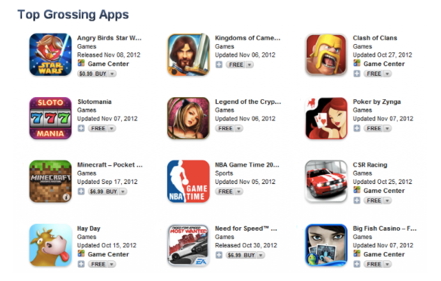
With more than 500 games submitted to the App Store every day, it’s hard to imagine a more competitive environment to get noticed. That’s why every little improvement to your listing is particularly important. With an average conversion rate of 4.47% (for games on the iOS App Store), even the smallest of changes can be hugely influential to your success or failure.
Of course, a quality app or game is what matters the most. A well-optimized listing won’t fix this. Yet, what steps should you take once your game is polished? When your UI is on point, gameplay is fine-tuned, well balanced, and all bugs and glitches are detected and fixed.
Once you’ve dealt with all of the above, you’ll want to pay closer attention to App Store page. In fact, optimization of each product page element can take your conversion rate to a whole new level. However, such great results require thoughtful A/B testing, consistency, and patience.
This guide will help to get your bearings in the art of crafting a high-converting app store page for your game. We will deconstruct optimization of the most impactful product page elements, such as app icons, your app name and subtitle, your screenshots, the app preview, and the description.
[bctt tweet=”The 5 essentials of a top performing app store page for games #gamedev #indiedev” username=”GameAnalytics”]
1. Icon selection
Careful selection of your icon is essential. It’s the first thing your potential user will see so it should capture their attention and instantly convey the genre of game. Core ingredients of a converting icon are simplicity, lack of excess visual elements, ability to stand out among competitors without losing touch with conventional principles of your store category.
The truth is a game icon matters more during an app discovery process. Once App Store visitors get to the product page of your game, they pay very little attention to the icon. So, the best way to perfect an icon is to run a series of category tests on the App Store. This will help you identify which of your icon variations perform better in the competitive surrounding.
If you study the icons of the top games, you’ll notice that the overwhelming majority use the same pattern: an icon depicts characters with their mouths open. It may seem silly, but the trick works. You can use this layout in designing one of your variations.
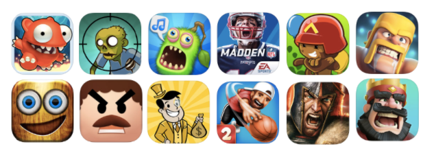
Indeed, numerous examples proved that placing a character in the game app icon impels a sense of action. Thus, a user wants to start playing right now. Sure, an open mouth is not the only option and it’s worth taking time to play around various facial expressions.
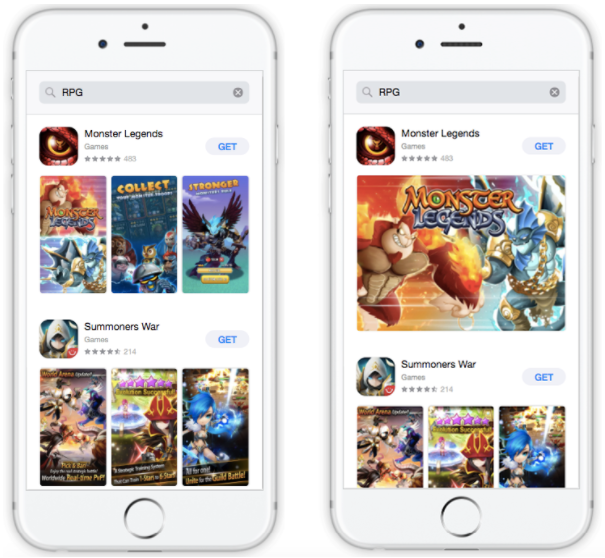
Testing of different characters on your icon is another highly recommended path which can lead to remarkable results. To give a recent example, MyTona ran a series of icon experiments for their game, Seekers Notes: Hidden Mystery. They started by testing a human character against a pumpkin head. The latter performed 9.3% better than the first one.
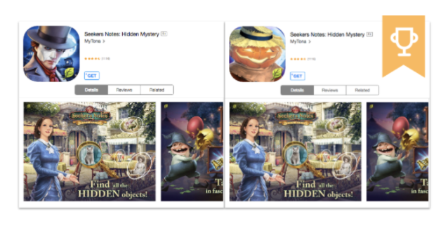
This result could arise from the fact that, for gamers, the male human character was less appealing than an inanimate object or maybe the open mouthed smile trumped the serious face. MyTona decided to go further and they added another smiling character during their next experiment.
The icon with the pumpkin head beat the serious man in a hat once again, but performed only 3.5% better this time. The new icon with the smiling witch smashed the previous two, with a 9.1% conversion lift. This experiment once again proved efficiency of ‘open mouth’ strategy and the significance of testing characters.
![]()
There are a few essential steps you should take when optimizing your icon:
- Study the icons of games in your genre, notice common features;
- Reflect best practices in your variations for testing conversion rates;
- Play around with characters, their facial expressions, angles, etc.;
- Opt for search or category experiments rather than store product page A/B testing.
2. App name and subtitle
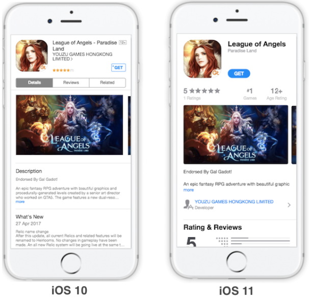
App name is subject to a subtle yet important change with iOS 11 emergence. Now game titles in the App Store can have only 30 characters, so it’s high time to forget about packing them with excessive keywords.
We’d even recommend that you keep the name of your game under 15 characters. This will prevent it from being cut short in the search results and ensure a slightly better tap-through-Rate.
Subtitles familiar to Android users are among iOS 11 debutants. This new App Store product page element will follow the app name and be limited to 30 characters as well. It’s a good idea to use a call-to-action in your subtitle (“Explore a new world”), as according to our recent study, this alone can improve conversion rate by 15-20%.
Our tests also proved that abstract subtitles generating vision, idea or intent and using powerful language that resonates with your target audience can result in rise of direct installs. At the same time generic descriptions with no pragmatic information (#1 game) won’t help that much.
3. Screenshots
Landscape screenshots always ruled the show when it came to the gaming category. This trend is likely to become even more prominent with iOS 11 App Store updates.
The major change is that redesigned search results will show 3 portrait screenshots instead of 2. Therefore such portrait screenshots will get smaller making captions nearly unreadable and layout details incomprehensible.
Our recent study showed that the first screenshot that looks like an ad banner can result in 45% conversion increase in Search. Moreover, the usage of banner-like landscape screenshots can help to repel your game’s closest competitor, turning its app listing into a blind spot.
Social Point decided to test this theory on their game Monster Legends. They launched a search results experiment with two variations to test the original portrait screenshots set against banner-like first screenshot in a landscape mode.
The latter variation beat the first one and reached 15.4% conversion. The result of the closest competitor was only 4.7% which proved the initial hypothesis about impressive banner-like screenshot performance in the search results.
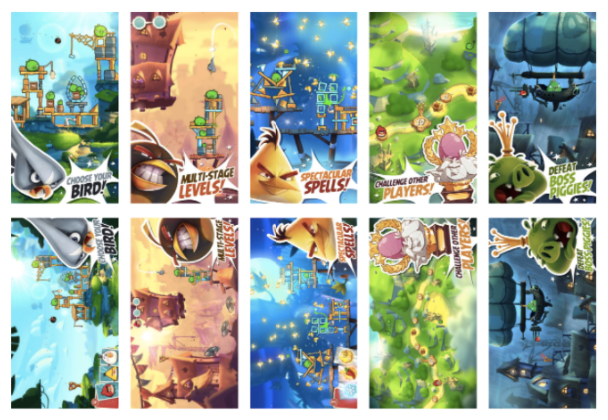
Nevertheless, A/B testing of screenshots orientation is a must for every game developer. What works for other games might be toxic for yours. Angry Birds 2 is the brightest example.
They ran a series of A/B tests before game launch. Rovio compared the performance of vertical screenshots with horizontal ones in the course of one of those experiments. Once the test yielded 99.7% confidence level, we got down to results analysis.
It turned out that portrait screenshots performed way better. Such surprising results could be explained by the fact that Angry Birds fans are not hardcore users on the whole and are more used to holding their phones in a portrait mode.
[bctt tweet=”How A/B testing app store screenshots helped Rovio improve conversions by 13% #gamedev” username=”GameAnalytics”]
The usage of portrait screenshots contradicted the game industry standards but helped Rovio enhance the converting power of Angry Birds 2 product page by 13% and get additional 2.5M installs just in a week after the launch.
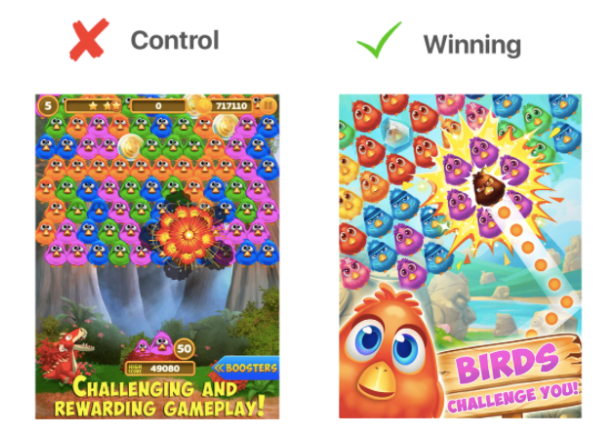
If you examine screenshots of game-leaders you’ll notice a few patterns you can apply in your screenshots layouts. A golden rule for a game screenshot can be formulated: battlefield/gameplay background + favourite character + powerful Call-to-Action or key feature caption.
ZiMAD decided to test the above mentioned layout before uploading redesigned screenshots to the App Store. The renewed screenshots for the game Bubble Birds 4 depicted the favourite characters of gamers, captions became more action-packed and brief, new background represented a mix of art overlays, real screenshots, and gameplay elements.
It’s definitely worth testing the following screenshots set: a banner-style landscape screenshot should go first, the rest of screenshots should reflect the abovementioned best practices in their design.
Don’t forget about orientation, experimenting with it is a must. It also makes sense to play around different characters of your game and identify top picks of your target audience.
4. App previews
One of the major product page changes in Apple update is related to app previews. Renewed product pages can have up to 3 app previews on them. The length of each video is limited to 30 seconds.
They will be auto-played in muted mode directly from the Store, it concerns both search results and product pages. Changing pictures in a loop will catch more attention of users than static video posters. Yet, it’s vital to use new opportunities wisely.
First of all, it’s forbidden to show UI outside of your game. And it goes without saying that app previews should include the most relevant content, the one the App Store visitors will get without thorough explanations.
It’s a good idea to start your game preview with something visual like users’ favourite gameplay or text animation (static text will look like an old video poster). Once you decided to use text in your video, make certain it’s easy to read even in reduced mode shown in search results.
The function of the first app preview is to give a brief and dynamic game overview which should trigger desire to learn more about it. The second app preview can be a bit slower and more introspective focusing on a few features that make your game unique. The third video can show advanced features a gamer can experience within your gameplay.
The App Store allows you to localize these videos for all markets, but you’ll need to be sure that the impact of localization is worth resources spent on it. So, it’s recommended to start with optimization for silence. A muted app preview is to be as understandable as one with the sound on.
5. Description and promo text
Our statistics state that only 2% of users read full app description tapping on the “Read More” button. Changes of iOS 11 will barely change this trend. There are a few common rules for description: make it brief and informative, give solid reasons to install your game, highlight best features and uniqueness of your game.
However, the first 170 characters of your full description which represent promotional text deserve your close attention and consideration.
In general, smart promotional text can help to increase conversion on the average by 35% according to our research, (we’ve witnessed maximum lift of 75%). Above all, you should use game promo text to promote special offers and the most important updates.
Afterthought
There are more and less impactful app store elements for sure, and it’s necessary to start optimization with the most powerful ones: subtitle, screenshots and app preview. Nevertheless, a key to game success in app stores hides in complex approach to ASO. Maximisation of game product page conversion is impossible without constant testing and experimenting.
[bctt tweet=”The 5 essentials of a top performing app store page for games #gamedev #indiedev” username=”GameAnalytics”]
Great performance in an app store isn’t a reason for wrapping all ASO activities. It’s vital to remember that every app store is an ever-changing system. What works today might make your game gravitate to the bottom tomorrow. So, equip yourself with patience, precision, and diligence and get down to polishing your product page.