· 6 min read
Homa Games’ Guide to App Store Optimization
Editor’s note: This article (and report) was written by the clever clogs at Home Games. You can read their original here.
Game’s go through a lot of stages from ideation to executing and testing during the publishing cycle. But having a game published and up and running in the app stores is only the first step in making it accessible to the widest audience possible. For game creators, the app stores are the main point of contact with users, and they are the place where users will decide if a game is worth downloading or not. So, in order to put everything in your favor, you will need to make sure your game is presented in the best possible way, with its main features displayed and with images and wording fully optimized. That’s where app store optimization (ASO) comes into play.
Every element of the app store page has the power to drive downloads to a game. Some time ago, app store optimization’s main focus was on texts—names and descriptions would include keywords and be fully optimized to showcase the app’s attributes while earning the first spots in search results. While this is still the case, lately the focus has strongly shifted to optimizing the visual aspect of the app store page, and now elements such as icons and screenshots are prioritized when attempting to drive downloads to a game. And this is what we’re going to tackle in this article.
Welcome to the app stores
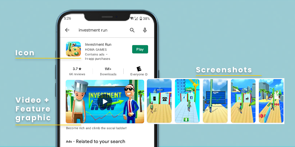
Before digging into the keys of image optimization for the app stores, let’s go over its four main elements and needed assets:
- Icon: Along with the app name, the icon is one of the the first things a user will see when entering the app store, and is essential for a good first impression. Simple and recognizable, make sure the game’s icon is not only visually appealing, but also a strong reflection of what the game is about.
- Feature graphic: This image will appear everywhere the game is featured in Google Play Store, so it should synthesize the entire gameplay experience. Also, if you have a video, this image will be used as its cover.
- Screenshots: They are also meant to communicate the user experience. Screenshots are a chance to showcase an app’s UI and to convey its features, capabilities, and look and feel. In gaming apps, they are also an opportunity to display the game narrative. The first three screenshots are critical, since the user may not scroll through the end of the bunch.
- Video preview: Although not mandatory in neither Google nor Apple’s app stores, videos are a very compelling way of showcasing an app. A game’s video preview should clearly show the gameplay and follow the five seconds rule: the main message must be clearly stated in the first seconds and the user should easily understand the content of the game in that timeframe.
So, when it comes to images, how do we deal with ASO for games? The first step is to have attractive, good quality visual assets, but when it comes to the app store, it’s also critical to take a very data-centric approach and to measure the assets’ performance in detail. For this reason, it is important to prepare a good A/B testing plan before the games are published, in order to have the assets ready and to avoid losing momentum after launch.
Preparing an A/B test plan involves, on the one hand, a good knowledge of the product and its marketability and, on the other hand, a research process to be aware of benchmarks and current app store trends and best practices. Both of these elements will inform the design of the different images in the first place, to make sure they bring forward the most iconic visual aspects of the game and they convey its main message in the most effective way.
An ASO research process includes benchmarking games of similar genres and themes, analyzing their visual style and the way they display their narrative. By taking a look at the icons, for example, you can observe visual patterns like the most used colors, or the kind of elements that are featured (main characters, environments, logos, etc.). Once you have extracted some conclusions, there are two possible paths: following the trends or going for a differentiation approach. And that’s where testing comes handy. Research will provide ideas and direction for designing the assets, but in order to know what will actually work in the app stores, everything should be tested.
Testing for the win
All the visual elements named above have the potential to improve the app store’s performance and have an impact on a game’s marketing success. In the next paragraphs, we’ll go through some A/B test experiments performed for the game Investment Run for icons and screenshots.
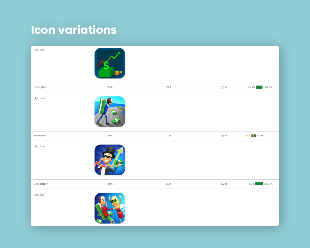
The first experiment tested different icons to evaluate their performance compared to the original, more generic icon used at launch. Unlike it, all the variations featured characters and all of them performed better than the initial listing. Of them, the first and the third variations center on the gameplay, one showing a successful path and the other one an obstacle. Both performed remarkably better than the first option.
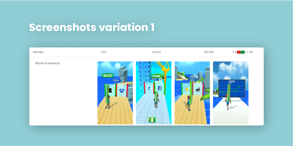
The second experiment takes advantage of the possibility of organizing screenshots in different orders, resulting in different narrative options. In this case, three sequences were tested focusing on different aspects of the gameplay.
The first variation shows the character between gates representing different investment opportunities, emphasizing the possibility of making choices that will impact the outcome of the game. In most of them the character is at the same stage of wealthiness as shown by his skin.
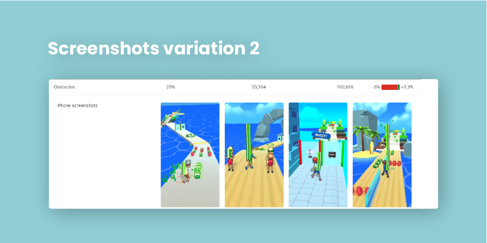
The second variation shows the obstacles the character faces through his investment path. This variation focuses on the challenges and difficulties, and turned up to be the least successful of them all.
The third variation highlights progression by showing improvement on the character situation, seen on his growing pile of money and better clothes. This was the winning bet, showing that choices are an appealing element of the game when associated with character progression.
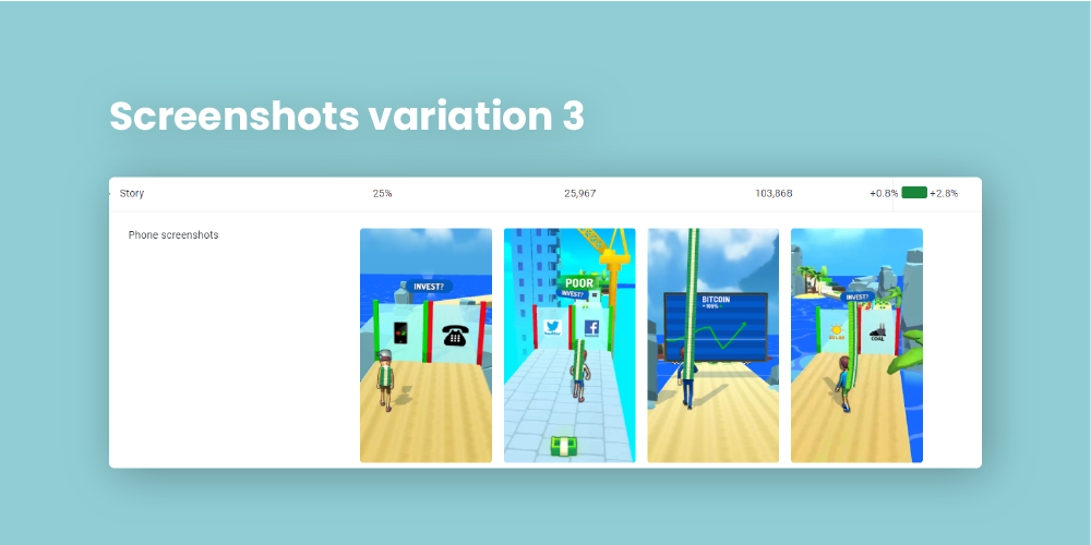
These are only some examples of the many elements that can be tested in the app stores. The screenshots displayed above, for example, present different environments and show variety. Another test could isolate this visual component and test the same game progression but in different environments or with different skins. What matters is to do the tests and to make the decisions based on them.
App store optimization is a mix between research and testing. At Homa, we have a dedicated Creative Department that actively works with Product, User Acquisition and Data Analytics teams to increase games’ stores visibility and KPIs. An ASO specialist will regularly monitor and analyze a game’s performance in the store and will also overview how similar games are doing to be aware of the latest market trends and benchmarks. If you have a creative profile, don’t hesitate to check our open positions in the Creative Department.
